

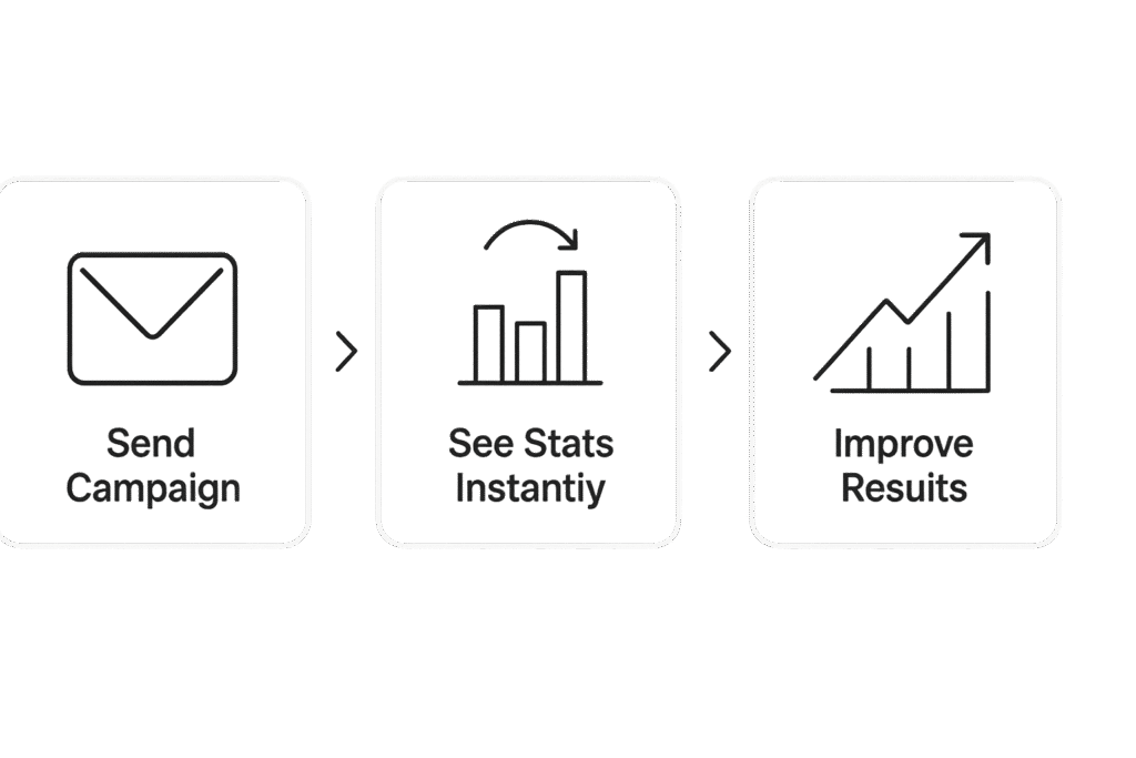
You run cold email campaigns. We show what happened.
See how many emails were sent and how many got opened, clicked, or replied.
Check which campaigns worked and which didn’t.
There is no need to guess or manage several spreedsheets.
Just one clear dashboard with everything that matter.
Most cold email tools stop after sending, but you need more than that.
You need to monitor cold email campaign stats for every campaign and mailbox. You need to see your overall email campaign performance in one place. That’s what this feature is for.
Our campaign analytics platform shows how many emails you sent, how many people opened, clicked, or replied, and which campaign or mailbox is doing better or doing bad.
You can sort everything by campaign, mailbox, or date. It’s fast, simple, and easy to understand. You don’t need to be technical.
This tool is made for cold email senders, not for marketers or newsletter tools. It’s for people who just want clear results.
You don’t need to scroll through random numbers. Just use filters to see what matters and what you need. That’s it.
Got multiple outreach campaigns?
Pick one or more to see how they’re doing.
You can compare email campaigns side by side or just focus on one.
Find what’s working and ignore what’s not.
Track each sender mailbox in one place.
See opens, clicks, and replies per mailbox.
No need to guess which one is underperforming.
That’s real mailbox analytics.

Choose how far back you want to look.
Last 7 days. 30 days. 90 days, or even pick a custom range.
You can also switch views by daily, weekly, or monthly.
That’s called filtering metrics by date range and details, but we just call it easy.
Charts make things simple. You can see replies going up, opens going down, and spot results fast without overthinking.
You can use bar chart or line chart visualization, and switch views anytime. Just hover over any point to get full info, our hover tooltips for detailed metrics show replies, opens, clicks, and more.
These are interactive charts for email performance, not just static graphs. You can scroll through, zoom in, and filter what you want to see.
You can even visual compare open rate across campaigns, so it’s easier to know which one is working better.
You don’t need to guess or export right away. Just look at your screen and the answers are there.
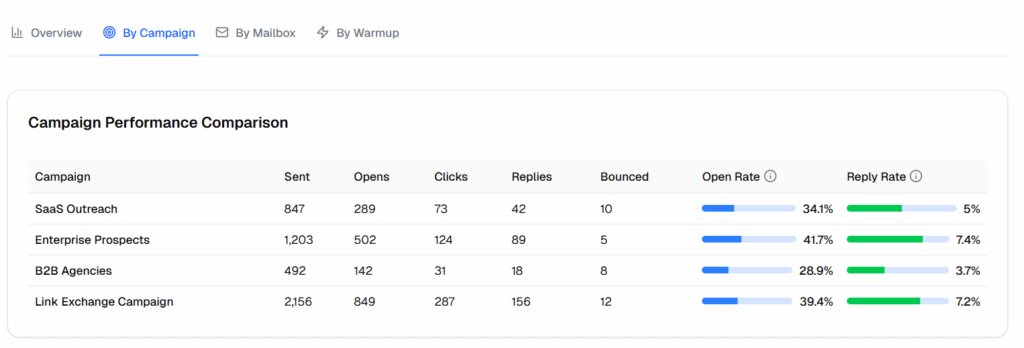
See how each campaign is doing in one simple view. You get all the key numbers for every campaign, sent, opens, clicks, replies, and bounce rate, in a clean table.
This is campaign performance analytics made easy. You can sort, compare, and find what’s working.
If one campaign has a low reply rate or open rate, you’ll spot it fast. You can also track click-through rate and see which subject lines or emails get more engagement.
All stats update live. No extra tools or reports needed.
You just open this page and see what’s working.
Want to know which sender mailbox is getting more replies?
Or which one has better open rates?
This section gives full mailbox-level email reporting. You’ll see mailbox analytics for every account you use, including sent, opens, replies, and bounce data.
It works just like the campaign view, but sorted by sender.
If one mailbox is underperforming or blocked, you’ll catch it early.
If one is getting more replies, you can use it more.
This helps you find what’s actually working and keep deliverability strong.
You can also export all this with our email campaign reporting tools and share it with your team if needed.
Sometimes you want to share results or just keep a backup. You can export analytics data in CSV or PNG formats with one click.
You don’t need extra tools. Just hit export and download clean reports.
Use the email campaign reporting tools to export full campaign or mailbox stats. Choose the format that works for you.
Want to build your own sheet? Just use the export CSV option. Need a quick image for a deck or update? Use export report as PNG. You’re not locked in. Your data is always yours.


We only track real campaigns. Warm-up emails are not included in your analytics.
Yes, you can turn off any metric you don’t want to see. Just uncheck it from the list (dropdown).
Yes, you’ll still see all stats from the time the campaign was live or completed.
Yes, you can select one or more campaigns and track them together.
You’ll see emails sent, opens, link clicks, replies, and bounces.
Yes, just set filters for the campaign or data you want, and export it.
Reply rates are based on unique leads. Only the first reply from each lead is counted.
Yes, analytics is available in all plans.
No, it works automatically once your campaigns are running.
Most tools just show numbers. PenguinMails shows you what matters.
Features
PenguinMails
Other Tools
Campaign Filters
Yes (multi-select)
Often limited
Mailbox Filters
Yes
Usually not available
Date Range Controls
Yes (7, 30, 90 days + custom)
Often just basic
Chart Views
Bar + Line with full metrics
One view only
Metric Toggles
Show/hide any stat (sent, opens, clicks)
Fixed view
Visual Comparison
Compare open/reply rates by campaign/mailbox
Not supported or manual
Export Options
CSV and PNG available
Mostly just CSV
Analytics that don’t make your brain 🧠 hurt.
PenguinMails gives you a clean email analytics dashboard that helps you track cold email campaign performance without confusion.
Nothing else, just your cold email data in one place.
Try our analytics now and see how it works for you.
PenguinMails is an affordable cold email automation tool made for startups and agencies.
It helps you land in inboxes with built-in warmups, smart follow-ups, and no sending limits.
You can even create mailboxes inside PenguinMails for free, no need to pay for external email accounts.
© 2025 PenguinMails.
A product of ContentLinkify LLC.
All rights reserved.
Built with ❤️ by founders who do cold email daily